Brand
A signature, not a slogan.
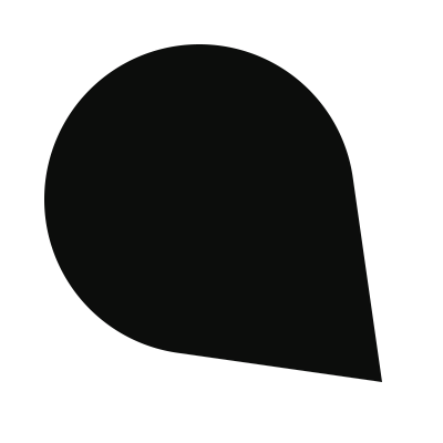
Qasha’s mark is the Q of its name drawn as the nib of a fountain pen. The counter of the Q is the nib’s breather hole, its tail the tip, and the slit runs between them: the conversation that ends in a signature.
The marks
Qasha
Colour
Ink
#0c0d0cText, the mark, dark sectionsPaper
#ffffffPages and cardsBone
#f6f5f1Quiet backgroundsPine
#22533fThe one accent: emphasis, the nib’s tipLight pine
#9cc9afThe accent on dark backgroundsType
From first conversation to recurring revenue.Newsreader, for headlines
Qasha keeps the whole relationship in one record.Inter, for everything else
Using the marks
- Leave clear space around the mark at least the width of its counter.
- Use the marks as they are: don’t stretch, rotate, outline or recolour them, or add effects.
- On photographs, use the white mark on a dark, even area.
- Keep the mark at 20 pixels or larger, and the app icon at 16.